
Disclaimer: ActBlue user roles and permissions dictate what users can do on our platform. If the tools or features mentioned in this article are unavailable to you, please speak to your Dashboard Admin(s) about updating your permissions.
In this article:
- Using the chart to target donors
- Using donor segments in your fundraising
- Reading your downloaded CSVs
ActBlue allows you to access and visualize sophisticated donor data or create targeted email lists without writing code. From your Dashboard, you can find the “Donor Segments” tab under the “Insights” section of your Dashboard menu.
Using the Chart to Target Donors
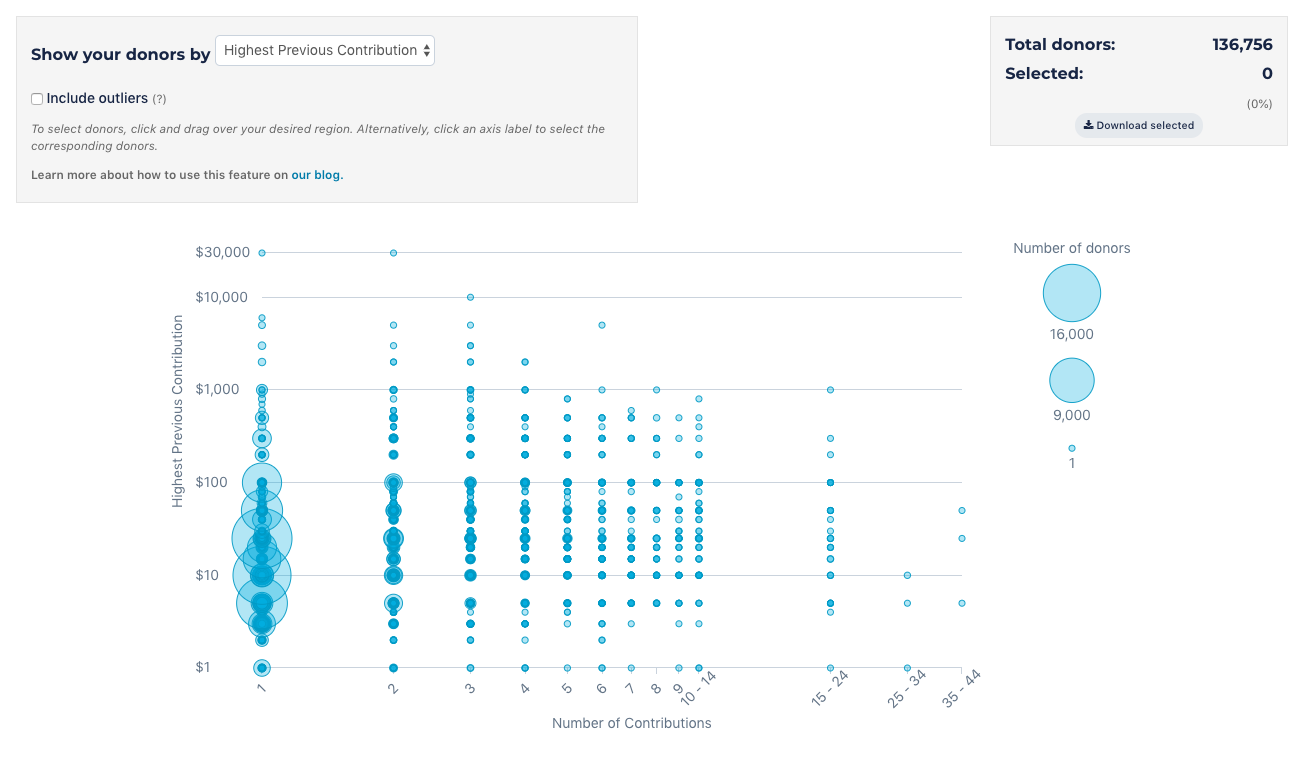
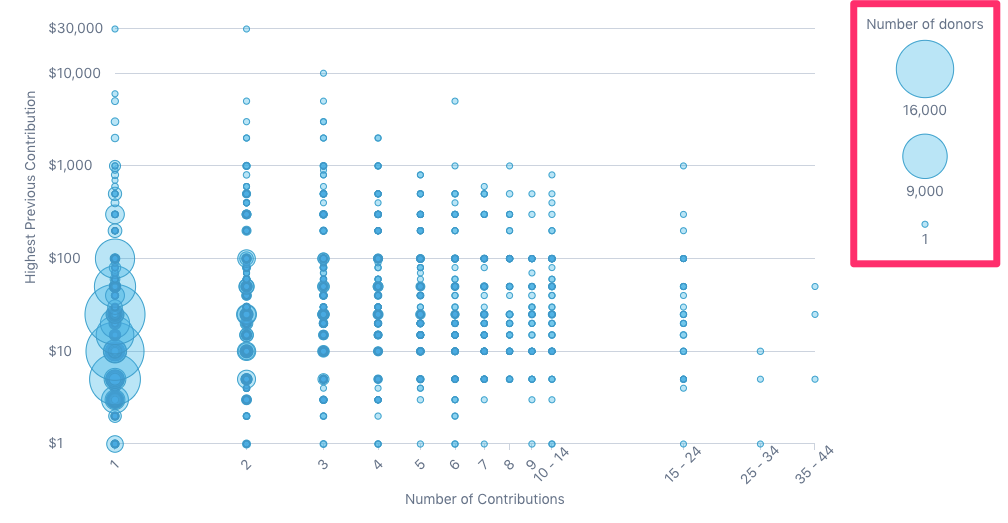
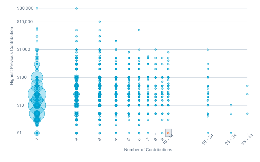
By default, you will see a chart showing your donors organized by highest previous contribution amount and the total number of contributions they’ve made to your campaign or organization through ActBlue. In the upper right-hand corner, you can see the total number of donors who have ever given to you (using email address as the unique identifier). The size of the blue circles indicates the number of individual donors. The key to the right of the chart shows you the number of donors the different sizes represent. This scale changes depending on how many donors you have.
You can also organize your donors by total contribution amount, which is how much a donor has given to your group in total. Click on the dropdown at the top to show your donors by total contribution amount. You can also show outliers (people who fall outside the chart's scale) if you want to include those donors in your targeting.
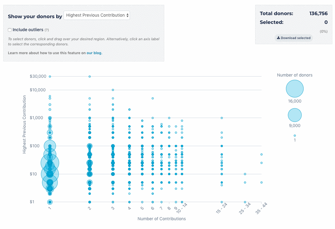
From here, there are many ways to use and visualize your donor data. For example, you can look at all the donors who have given donations under a certain amount on multiple occasions or look for donors who have contributed a large amount but only donated once. Here’s how to customize this helpful data to fit your needs.
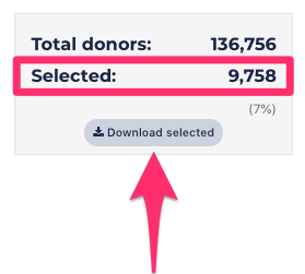
To select a custom data set, drag your mouse and draw a box around your desired donors. The gray box in the upper right-hand corner will show a breakdown of the total number of donors in the chart compared to the number of donors you’ve selected.
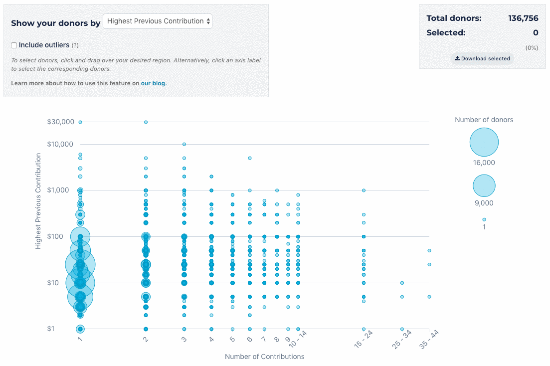
You can also click a dollar value on the y-axis or a number of contributions on the x-axis to highlight a row or column.
Then, click “Download selected,” and you’ll have a CSV of those donors you want to target!
Please note that values on the y-axis are rounded as follows:
- $1 - $5: rounded to the nearest dollar
- $5 - $25: rounded to the nearest $5
- Tens greater than $25: rounded to the nearest $10
- Hundreds: rounded to the nearest hundred
Any values on the x-axis greater than ten are rounded to the nearest ten.
Using Donor Segments in Your Fundraising
Access to this donor data allows you to send targeted fundraising asks and communication customized for specific donor segments.
Here are some examples of how you could use this data:
- Download data for donors with the highest previous contribution amount of $25. Thank these donors for their support and ask them to deepen their investment by giving $40.
- Download data for everyone who has given you $5 or less and ask them to start a monthly recurring contribution of $3.
- Download data for donors with a lifetime total of $100 or more. Send them a thank you email and share how their support will help you continue your work!
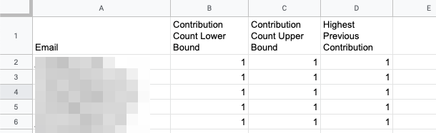
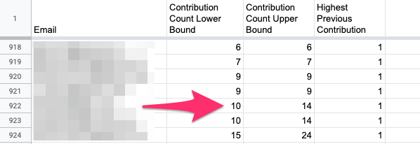
Reading Your Downloaded CSVs
The most important information in your CSV will be the emails of donors you intentionally selected using the “Donor Segments” tab. While emails are the only information you should need, here’s more about reading your CSV. The first row organizes your donor data:
- Contribution Count Lower Bound
- Contribution Count Upper Bound
- Highest Previous Contribution or Total Contribution Amount.
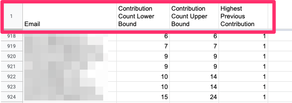
Contribution Count Lower Bound and Contribution Count Upper Bound refer to a donor’s x-axis position on the chart. For example, a donor who has only made one contribution will have a Contribution Count Lower Bound of one and a Contribution Count Upper Bound of one.
A donor who has made twelve contributions would appear in the 10-14 column of the x-axis of the graph below. This donor’s Contribution Count Lower Bound would be ten and a Contribution Count Upper Bound of fourteen.
If you have any questions, please contact our support team using the email address you use to access your ActBlue account.